Landing Page vs One Page
the whats, whys, whos and hows, including how they differ
Although their names sound very similar and are often used interchangeably, it is not entirely accurate to equate the two. The primary difference between One Page and Landing Page is in their purpose, but it does not end there. And although this difference can often be subtle (One Page can sometimes be a Landing Page and vice versa), it is still worth knowing the exact meaning that lies behind each specific phrase, and when we can apply it.
The text below will help you figure out how to use the above-mentioned names correctly and which of these pages will work best when it comes to your project.
One Page
One Page is usually a simple website which consists of only a home page. It captures the essence of the topic in question, presenting the most important information related to it. This type of web page is often used to create company websites, especially when the brand does not have a large amount of content and wants to create an online presence for itself or a specific product or service. One Page does not contain subpages – all content is placed on one home page. Usually such pages are created in a categorised way, placing all the information in separate sections which users move between by scrolling (up-down), and decorating them with attractive graphics, but there are also more horizontal-type solutions which can be interesting.
Due to the small amount of content, this type of website does not need to have a CMS, but an appealing visual effect is extremely important – graphics, layout, interesting solutions and animations, i.e. everything that will make the website fun and interesting to the user.
It’s worth opting for One Page when you want to get a creative and outstanding website, while at the same time you don’t have a large amount of material to present. It’s also perfect for when you care more about the effect than the ability to edit the content (we encourage you to talk to our team, who will help you pick out the best solutions without generating unnecessary costs).
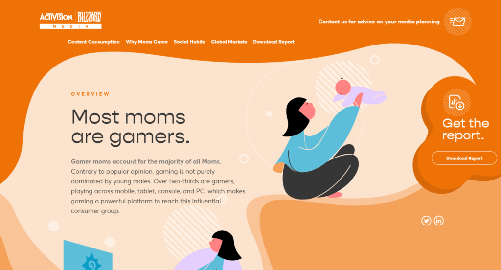
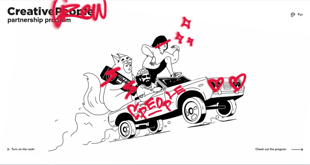
Interesting One Page examples:
Monokai.nl:

Activisionblizzardmedia.com:

partners.cpeople.ru

Landing Page
As the name suggests, this is the page where you “land” (usually after clicking on one of the other elements of the promotional campaign). This type of web page may resemble One Page, but is usually created and tailored to a specific marketing campaign. Users who click on an online ad (e.g. Google Ads) are usually redirected to this type of web page, which has been specially designed for the specific ad.
The Landing Page life cycle is most often linked to the period of the advertising campaign, so these are usually simple web pages containing a form for generating sales leads. They usually do not present the full range of products and services or information about the company, but rather a specifically chosen item related to the given campaign, e.g. a product or promotion.
The Landing Page should not be created instead of the company website, but rather be an additional element to it.
Its key advantages are, first and foremost:
• Separation of the permanent part of the website from one-off or seasonal promotions. This means we can break free of the close connection with the company’s home page, and the user can focus on the content related to one specific offer.
• Tailoring the content to a specific advertising campaign and using matching keywords, without affecting the main company website.
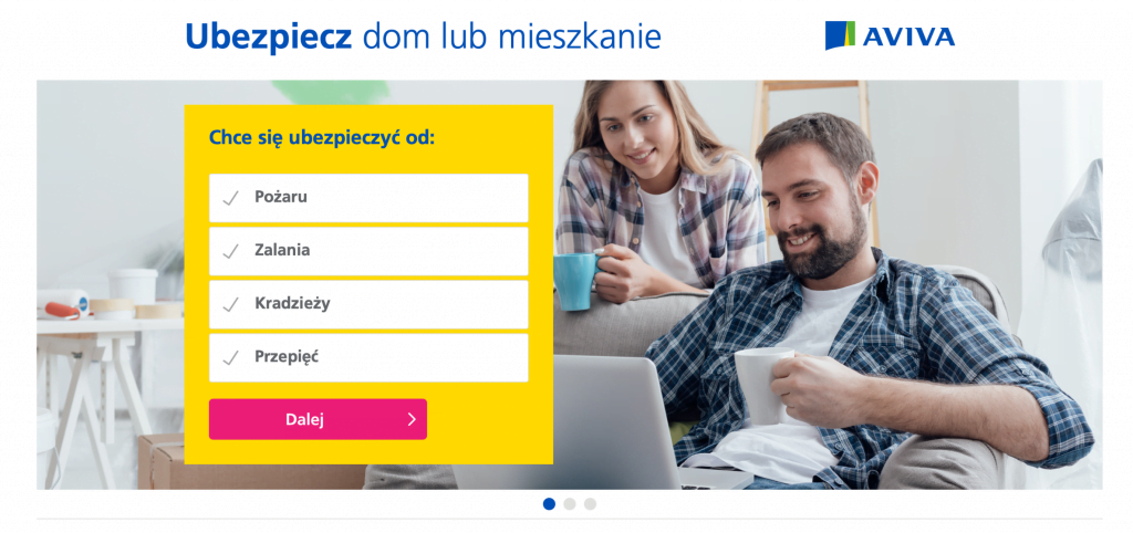
Landing Page examples:
Landing Page for the mBank “eKonto Junior” promotional campaign:

Landing Page for the promotional campaign of the AVIVA insurance offer:

In summary
| One Page | Landing Page |
|---|---|
| A single (usually arranged into sections) web page that can be used as a company website or a specific product page. | The page a user lands on from an advertising campaign. |
| More focused on presentation purposes, emphasising the company’s main advantages (such as professionalism) and displaying them in a visually appealing way. | More focused on presenting a specific offer or service and acquiring customers; these pages encourage them to leave their contact details. |
| Often presented in a creative way, using appealing visual effects (e.g. while scrolling). | Due to the fact that this page often has a predetermined life cycle (related to a specific offer), it is simple and free from time-consuming effects. Here, greater emphasis is placed on usability, in order to better convey the details of the offer and facilitate establishing contact with the customer. |


